
 Planning a website design can seem like a daunting task, especially when you’re starting from scratch. So, it’s all about grounding the process with a thorough understanding and clear objectives.
Knowing your audience like the back of your hand is half the battle.
Do they love modern, slick designs or do they lean towards something more classic and traditional?
Cracking this nut can help you align your design choices with their preferences, ensuring they stay around longer and maybe even hit that subscribe button.
Imagine navigating a website like a well lit hallway. They should easily glide from one section to another without bumps or dead ends. User journeys need to be mapped out meticulously, lest your visitors get lost in cyberspace. Think of every single click leading to another decision point or information they require. Starting from your homepage and crafting pathways to contact forms, product pages, or whatever’s crucial is key to a coherent user experience.
Aesthetic elements are like the coating on your favorite chocolate bar, sweet but not overwhelming.
Functional design isn’t about going minimalist but making sure every component has a purpose. Toss in stunning images, compelling CTAs, and clean layouts but ensure they align with your site goals.
Maybe opt for a streamlined, modern aesthetic or something artsy if that’s your jam, but always with the end user in mind.
Speaking of navigation, it has to be zero clutter.
A site’s main menu is like a roadmap. Remove unimportant stops and keep it straightforward. It should direct people intuitively. Dropdowns should be a breeze and links should work, no surprise roadblocks allowed.
Think about those sites where finding the contact page feels like solving a Rubik’s Cube. Don’t be that website.
We’re living in a mobile first world, and that’s the truth.
Your site shouldn’t just shrink to fit on smaller screens but rather morph into something equally engaging as it is on desktops. Mobile users think quickly and if your site drags, they’re out.
Test your design on multiple devices because everyone travels with their own little window to the internet. User experience should feel seamless whether on a tablet at home, or a smartphone on a crowded subway.
The Power of Colour: Choosing the Right Palette for Your Website
Set The Tone With Colours
Colours can make or break the vibe of a website, setting the tone before a single word is read.
They have the power to evoke emotions and influence decisions, so getting them right is crucial.
Imagine your website as an outfit, colour choices shouldn’t clash but rather complement, making the biggest impression without words.
The 60-30-10 Rule
When it comes to good design practices for colour, balance is the name of the game.
A solid rule of thumb is the 60-30-10 rule: 60% of your primary colour, 30% of a secondary colour, and 10% as an accent. This creates a balance that’s visually appealing and keeps things from looking chaotic. It’s like framing a picture perfectly, drawing attention without being overwhelming.
Match Your Brand Identity
Starting the colour selection process might feel like standing before a painter’s canvas.
The key is to focus on what colours resonate with your brand’s identity. Are you going for energetic and vibrant, or cool and professional? The colour wheel is your friend here, aiding in selecting combinations that won’t compete for attention. A cohesive look makes for a stronger brand impression.
Utilise Tools to Help
Tools like Adobe Colour or Canva’s color palette generator are very handy, offering palettes that naturally go together while allowing you to play around with shades and hues.
They save time and help ensure your chosen colours look great on the screen. Using these, you can explore options without jumping in blind, ensuring your site reflects exactly what your brand is about.
Beyond just aesthetics, colours should be functional too, considering accessibility.
Contrast is key, Legibility on both computer and phone screens matters greatly, especially for users with visual impairments.
Use tools like WebAIM’s Contrast Checker to ensure your colour choices meet accessibility standards, making your site inclusive and user-friendly.
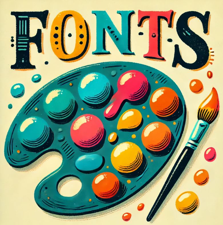
Font Selection: Ensuring Readability and Brand Consistency
Be Heard Loud and Clear
Fonts might seem like the quieter sibling to colours, but they’re just as significant in conveying your brand’s personality.
Picking a font goes beyond aesthetics; it’s about ensuring readability and reinforcing your message. You want to be heard loud and clear, not mumbled over a sea of mismatched scripts.
Font Colours for Legibility
Choosing a font color might sound trivial, but it makes a difference. Your aim is legibility, so pairing the right colour with your text is key.
Think of high contrast. A dark grey or black on a white background typically works wonders for readability.
If your background isn’t white, find the most contrasting colour without straining the eyes.
Always test different devices to see how your colours perform in the real world.
Pair Fonts Like a Perfect Couple
When pairing fonts, you want them to complement each other, like a perfect dance couple.
The right pair doesn’t just look good, they enhance the user experience by guiding users through the content effortlessly.
So, perhaps pair a bold, eye catching header font with a more understated, readable body font.
Google Fonts is a treasure trove, offering free access to a multitude of options that suit various styles.
Choose Your Font To Match Your Brand
The right font does more than just relay information, it’s part of the dialogue between your brand and its audience.
Different styles can communicate moods and tones. A serif might convey tradition, while a sans serif suggests modernity.
So pick a font that’s in sync with your brand’s voice, one that whispers or shouts exactly what you need it to.
Be Readable
Accessibility in typography is non negotiable.
Everyone, regardless of their abilities, should easily consume text. Ensure accessible font sizes by using scalable units like em or rem in CSS for responsive design. This way, text adjusts smoothly across devices, accommodating everyone from teenagers with top notch sight to elders getting their daily news fix.
Incorporating these elements carefully ensures your layout is not only stylish but functional, keeping users engaged and informed. After all, your choice in typography could be the difference between a bounce and a conversion.
Bringing It All Together: Integrating Design Elements for Maximum Impact
Combine Your Fonts And Colours To Make The Magic Happen
Combining all aspects of design is where the magic happens.
When chosen carefully, colours and fonts become more than just visual elements, they weave together to bring your website to life, resonate with your audience, and boost brand recognition. This synthesis of design components isn’t just about looking good, it’s about solidifying your online presence and message.
Be On Brand
Colour and font choices should align seamlessly with your overall branding strategy.
Think about your favorite brands. Their distinct colors and fonts probably linger in your mind long after you’ve navigated away. That is the goal. Creating a memorable identity that sticks, and speaks for you when words aren’t enough.
Seek Out Feedback
Testing these elements on real users is crucial.
Feedback provides insight into how users interact with your website and which areas need tweaking.
Is your text easily readable on different devices and under various lighting conditions? Does your colour scheme evoke the intended emotional response?
Listening to user feedback can guide last minute adjustments and ensure your site performs optimally.
And Don’t Forget SEO (Search Engine Optimisation)
Design choices also play into SEO and site performance.
Fast loading fonts and harmonious colour schemes can affect bounce rates and overall engagement, indirectly aiding with search engine rankings.
Everything here ties back to user experience, which should be your foremost priority.
Have a Sneaky Spy On Competitor Sites
Analyzing competitor sites can offer fresh perspectives and inspirations. While it’s a no-no to copy them directly, observing what works for successful websites can give clues about what might resonate with your audience, fueling your creativity and enhancing your design strategies.
The end game is a website that’s not only functional but also reflects your brand identity.
It’s about crafting an experience, a journey for your users that’s rewarding and memorable, making them want to return again and again.